Remember the good old days, when we used tables for almost every layout problem we had to face? Those were rebellious days, where no one ever cared about semantics and clean code *sig* I’m getting nostalgic…

Today things are different, but fortunately the W3C gave us some neat CSS properties to make normal HTML elements behave like tables. However, they live a hidden life, while designers still use floats and negative margins to find what is considered to be the Holy Grail of Webdesign (aka fluid multi-column layout). Floats were used for a good reason, since IE6 & 7 weren’t able to render CSS tables, but IE8 was released almost three years ago, so I guess it’s time to abandon floats in favour of CSS tables and approach to a more modern kind of Holy Grail.
So, if you can’t go with graceful degradation when it comes to IE7 and below, you probably should stop reading here, but everyone else who wants to know how to achieve a flexible layout grid, including full height columns and a sticky footer, that works in IE8+, Firefox 2+, Safari 4+, Opera 8+ and Chrome 10+ (probably even more), should download the examples and read on.
An easy start

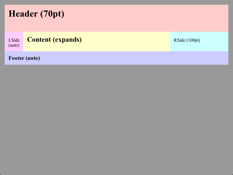
This simple example (simple.html) resembles what most float-based layouts offer: You can split the page in several rows and columns, define their sizes and make some of them expand over the whole available space. IE7 and other browsers, which are not able to render CSS tables, will render the columns as rows, but the layout will stay usable as you can see on this IE7 screenshot.
Apart from that our little layout grid can even more than its floaty counterparts, since it allows you to use min-width on flexible columns and it ensures that all columns in a row always have the same height, which is quite handy when you want to put a background behind your menu or sidebar. So let’s take a look on the CSS code:
*>/**/.Grid {
	-moz-box-sizing: border-box;
	-webkit-box-sizing: border-box;
	box-sizing: border-box;
	display: table;
	width: 100%;
	height: 100%;
}
.Grid>.Row, .Grid>.Column, .Grid>.Row>.Column {
	height: 0.1%;
	position: relative;
}
.Grid>/**/.Row {
	display: table-row;
	height: 1px;
}
.Grid>/**/.Row.Expand {
	height: auto;
}
.Grid>/**/.Column, .Grid>/**/.Row>.Column {
	display: table-cell;
	height: auto;
	width: 1px;
}
.Grid>/**/.Column.Expand, .Grid>/**/.Row>.Column.Expand {
	width: auto;
}
Pretty short compared to the float-layouts, eh? The code might look a bit strange due to all these empty comments (/**/), but they are necessary to prevent IE7 and below from reading certain blocks. Setting height:0.1% is another IE7 fix that ensures, that all margins stay inside the layout-cells.
As you can see everything starts with the .Grid class, which is nothing more but a CSS-table which uses 100% of the whole available width and height. Since this usually makes the use of margins, padding and borders impossible I’ve set box-model:border-box in order to make at least padding and borders working again.
On the first look the .Row and .Column classes simply define CSS table-rows and -columns, so there’s nothing interesting about that, but notice the height and width properties. This is where the trick is done: By setting height/width:1px a normal cell will use the minimum amount of space to display its contents, leaving all unused space for the .Expand class cells with height/width:auto. You might wonder, why we also care about the row height. It has no effect in this example indeed, but you’ll see what it is for in the next section.
That’s all CSS, so I guess we can examine the HTML code now:
<div class="Grid">
	<div class="Row" style="height:70pt;">
		<h1>Header (70pt)</h1>
	</div>
	<div class="Row Expand">
		<div class="Grid">
			<div class="Column">
				<p>LSide (auto)</p>
			</div>
			<div class="Column Expand">
				<h2>Content (expands)</h2>
			</div>
			<div class="Column" style="width:150pt;">
				<p>RSide (150pt)</p>
			</div>
		</div>
	</div>
	<div class="Row">
		<h3>Footer (auto)</h3>
	</div>
</div>
Pretty straight forward, no mystic nesting, empty nodes etc. A fixed width or height can be defined simply by setting the according property value of the cell and we don’t even have to define a .Column or .Row element when the grid only has one row or column. Grids with multiple rows and columns are also possible, but more on that later.
Making the footer sticky
I recommend to read my post about flexible sticky footers, if you want to know how exactly the code here works. The idea described in that article can be somehow called the ancestor of this post, therefore I won’t explain everything here again, but go on with describing how to create a sticky footer with our little CSS layout grid.
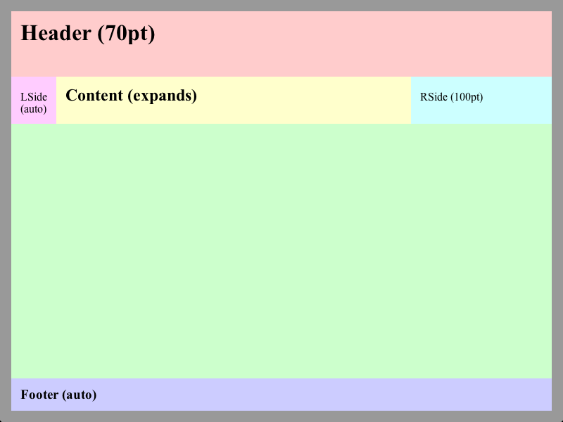
I guess it’s quite obvious what the footer example (footer.html) does, so I continue right away with the CSS code needed to make this possible:
html, body {
	height: 100%;
}
Yap, that’s all, since we’ve added the code for expanding rows already in the first example. Now the footer will stick to the bottom of the page even if the content is shorter than the viewport-height. That’s pretty much all you need to know to use this CSS layout grid, but you might want to continue reading to learn some more advanced stuff and how to fix a minor display issue in IE and Opera.
A dirty little workaround
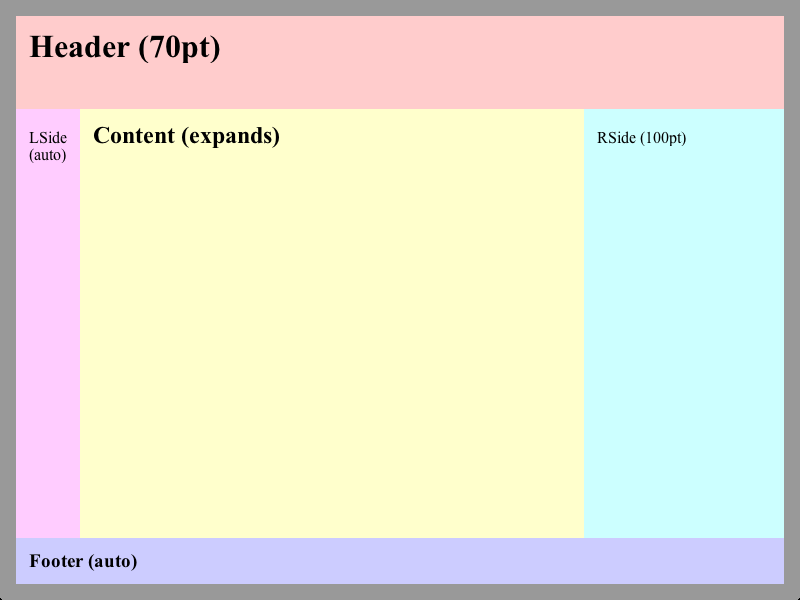
Unfortunately Opera and IE display the inner grid (that’s the one with the columns) a bit different, so you might have to add some additional code, if you need the columns to span the full viewport-height, too.

This is how the footer example will look like in Opera and IE, therefore I’ve created a fixed footer example (footerfix.html), that expands the columns to the full height on all browsers. However, the grid works fine without this fix and the cases where you need full height columns in every case (meaning any windows size, any content height and any browser) are pretty rare. That’s why I think that you won’t need this fix for most of your layouts, but as curious beings let’s have a look anyway:
The problem seems to be that these browsers use the height of the cell-content and not the height of the cell itself as the base-value when converting percent values to pixels. Alas the W3C specification is a bit vague here, so it can’t be considered as a bug. However, we want to get rid of that behaviour, so we have to use a little JavaScript here to get the height of the cell and set the grid height:
if (window.attachEvent) {
	function fixGrid() {
		var grid = document.getElementById('Inside');
		grid.style.height = null;
		grid.style.height = grid.parentNode.offsetHeight+'px';
	}
	window.attachEvent('onload', fixGrid);
	window.attachEvent('onresize', fixGrid);
}
The fixGrid function gets the DOM-node of the inner grid (id="Inside"), removes any height values set by previous calls and updates the height property with the current pixel-height of the parent-node (the middle row of the outer grid). The function will be called after the page has been loaded and after resizing the window (that’s why we need to remove old values). Fortunately the attachEvent function, which is the only way to dynamically attach events to an element in IE8, is also implemented in Opera, but in no other browser, so we can use it as a filter as well.
I’ve kept the above code simple to keep the focus on how the whole thing works, so it’s no general solution for the problem, but I think it’s quite easy to adapt it to your needs. BTW: It would be nice if you post a comment here, if you’ve written a script that works better :) And remember: This script is purely optional for most layouts.
Some additional notes

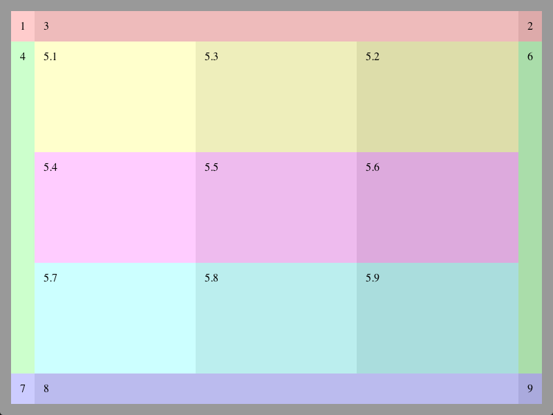
This example (combined.html) combines everything mentioned above and shows how to use multiple rows and columns in one grid. There’s no additional code, but I’ll use this example to explain some things that you might notice as ‘odd behaviour’ when creating your own layout grid.
1. You might notice, that each row of a grid has the same number of columns. This is not a coincidence, but necessary since CCS tables have no colspan or rowspan concept. Therefore you have to use nested grids, if you need rows with a different number of columns.
2. You’ll see that the inner grid distributes the space equally among its cells. This happens if no cell is part of the .Expand class and not really a surprise, but when you, for example, set the with of first inner column (5.1-5.7) to 200px the column won’t be of that size but bigger, while the other columns would be smaller than before.
Here’s the explanation: If the grid has a for example a width of 500px, then the sum of all column-widths (200px+1px+1px) is 298px smaller than the grid. This unassigned space has to be distributed between all columns resulting in them being wider. Browsers differ in the way how they distribute the remaining space, but the basic idea is the same, so you can think of the width property in a row without an .Expand column as just another way to set the minimum width.
3. To speed up rendering you might want to set table-layout:fixed for a grid that only consists of rows. This won’t work for columns, since all .Column elements without .Expand will be forced to have a width of 1px.
4. This is not part of the example, but you might want to set a border or a shadow of a cell in a grid that only consists of rows. This is not possible, since table-row elements ignore these properties, but you can add a single column (table-cell elements allow borders and shadows) to the row and put your content there.
The usual final words
Apart from the above mentioned cases, the handling of this CSS layout grid is quite easy, but don’t hesitate to ask if you need more clarification on some aspects. I’m using the grid for two of my projects right now and I’m really happy with it. A good starting point for creating your own layout are the examples I’ve used in this article. However, I’d like to see some layout templates based on the grid here in the comments :)
Errata
Webkit height issue: Webkit based browsers (Safari, Chrome, etc) seem to have some rounding issues when they have to distribute the remaining vertical space in a grid, where all rows have a fixed height. This results in a small gap between the bottom-line of the last row and the actual bottom-line of the grid (dark space in this screenshot). Fix: This can be fixed easily by inserting at least one row with height:auto (e.g. via class="Row Expand") into the grid. (combined.html fixed on 2012-03-02)
Chrome “Window Resizer” height issue: This Chrome extension (others could have similar issues) doesn’t seem to like it, when the document body is no display:block element. Therefore adding the body element to the .Grid class will cause the grid to use only about two-thirds of the window height (screenshot). Fix: Insert a div element right after the body and add this to the .Grid class. (all examples fixed on 2012-03-05)
